Cookie banner hides the main CTA on phone
High
hierarchy
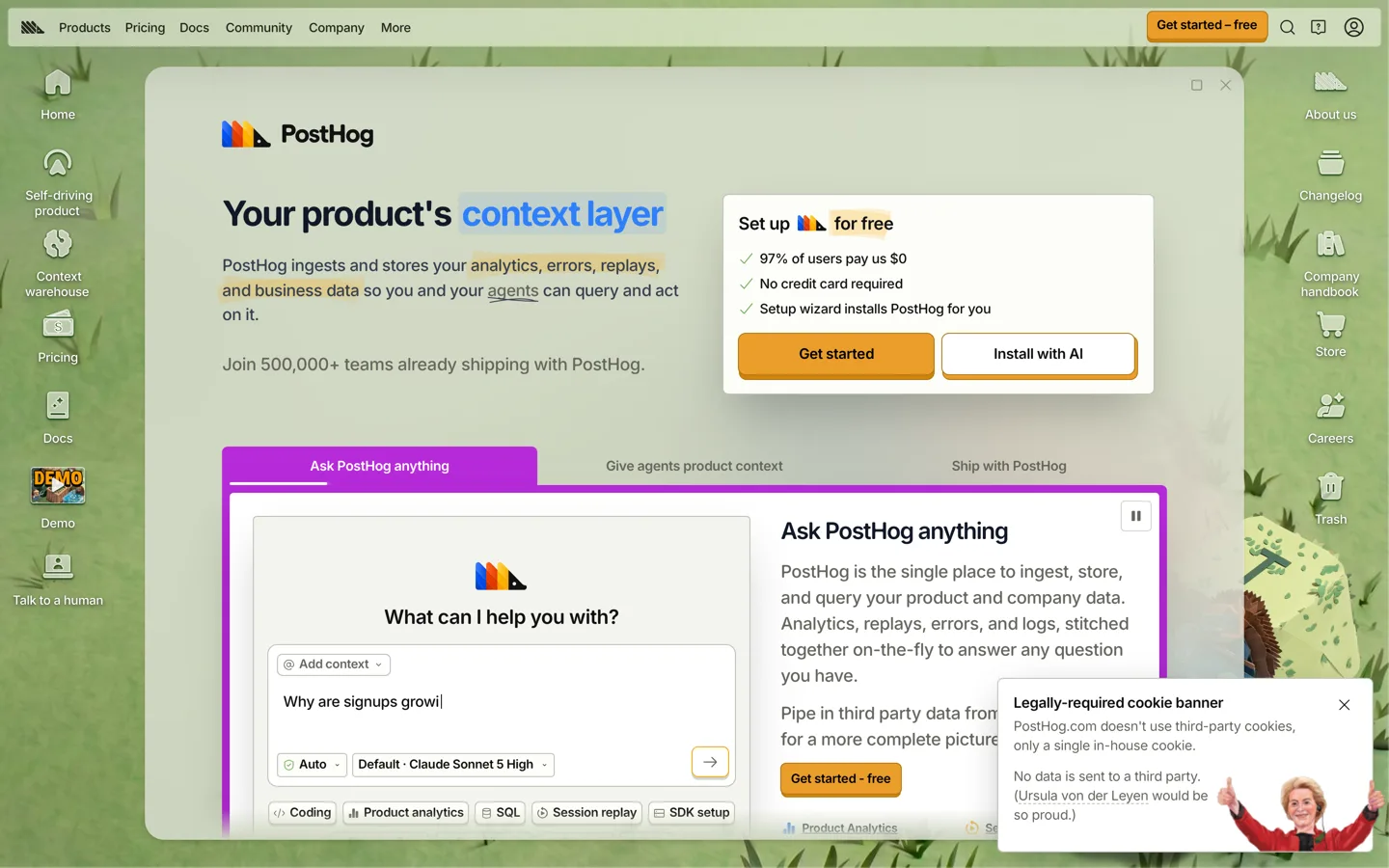
Seen. Phone, first viewport: the cookie banner covers the bottom 40% of the screen and cuts the orange "Get started" button in half.
Why it matters. On first load a phone visitor sees a joke about cookies where the sign-up button should be, and has to dismiss it before they can act.
Fix. Under 640px, make the banner a single-line bar pinned to the bottom, about 64px: one sentence and a close. Move the illustration into an expandable section.
Four accent colours compete in the first viewport
High
restraint
Seen. Desktop, above the fold: orange on three buttons, a blue chip on "context layer", yellow highlighter strokes on the subhead, and a purple demo frame, all at once.
Why it matters. When four colours shout, the button that earns money is just one of the four.
Fix. Keep orange for actions only. Tone the demo frame down to the page's neutral grey-green. Keep one highlight treatment in the hero, not three.
The full report has 11 findings, the order to do them in, and the numbers behind the score.
Read the full PostHog report