Second Lookdesign review · 6 October 2026
polsia.com
An autonomous AI agent that says it plans, codes, markets and sells for a company around the clock. For Solo founders and indie hackers who want to start or run a company without hiring.
First impression
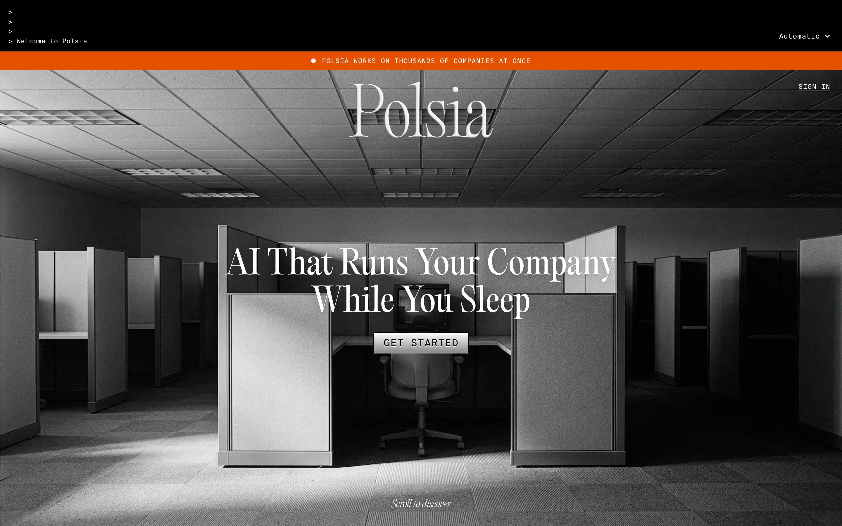
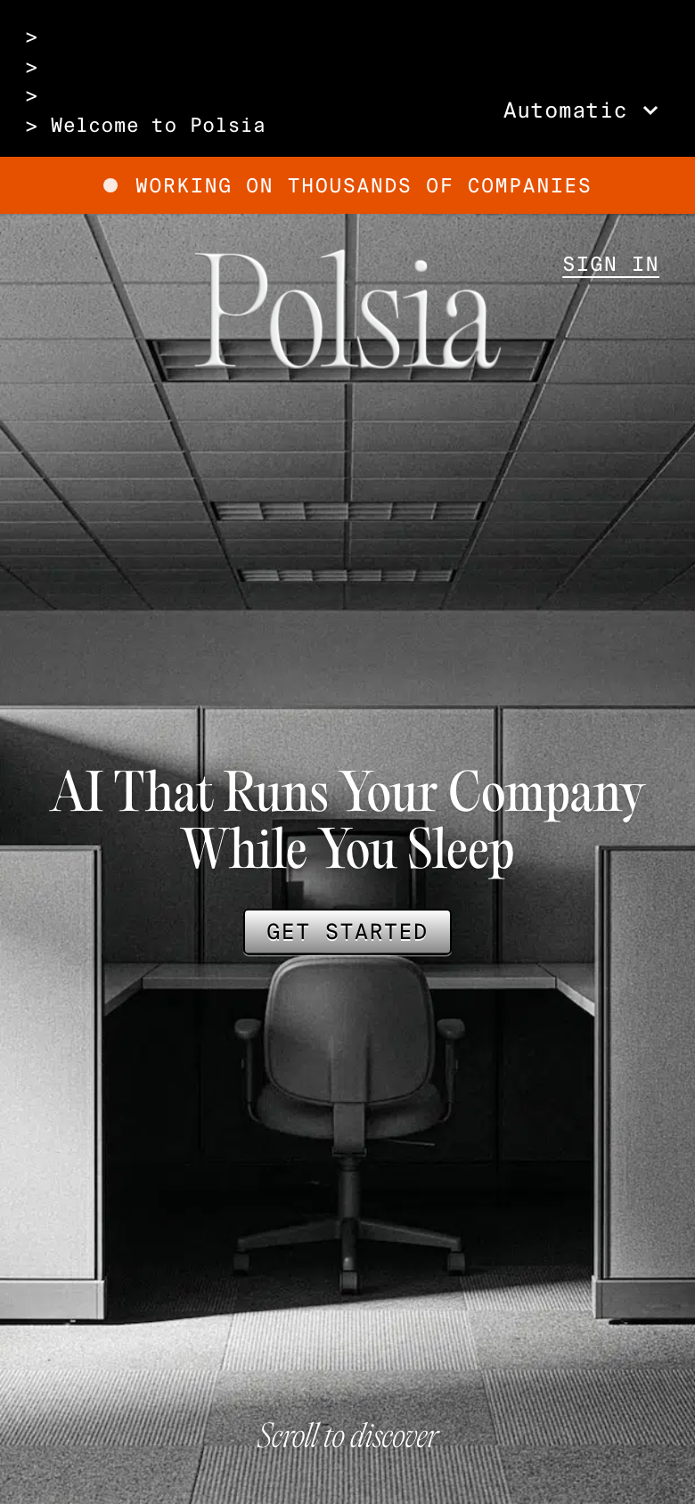
Ten-second test. "AI that runs your company while you sleep" gives the mood and who it's for, but neither viewport shows what the product does, what you get, or what it looks like. 'Get started' doesn't say what happens next. The terminal ticker and the 'Automatic' dropdown add noise rather than meaning.
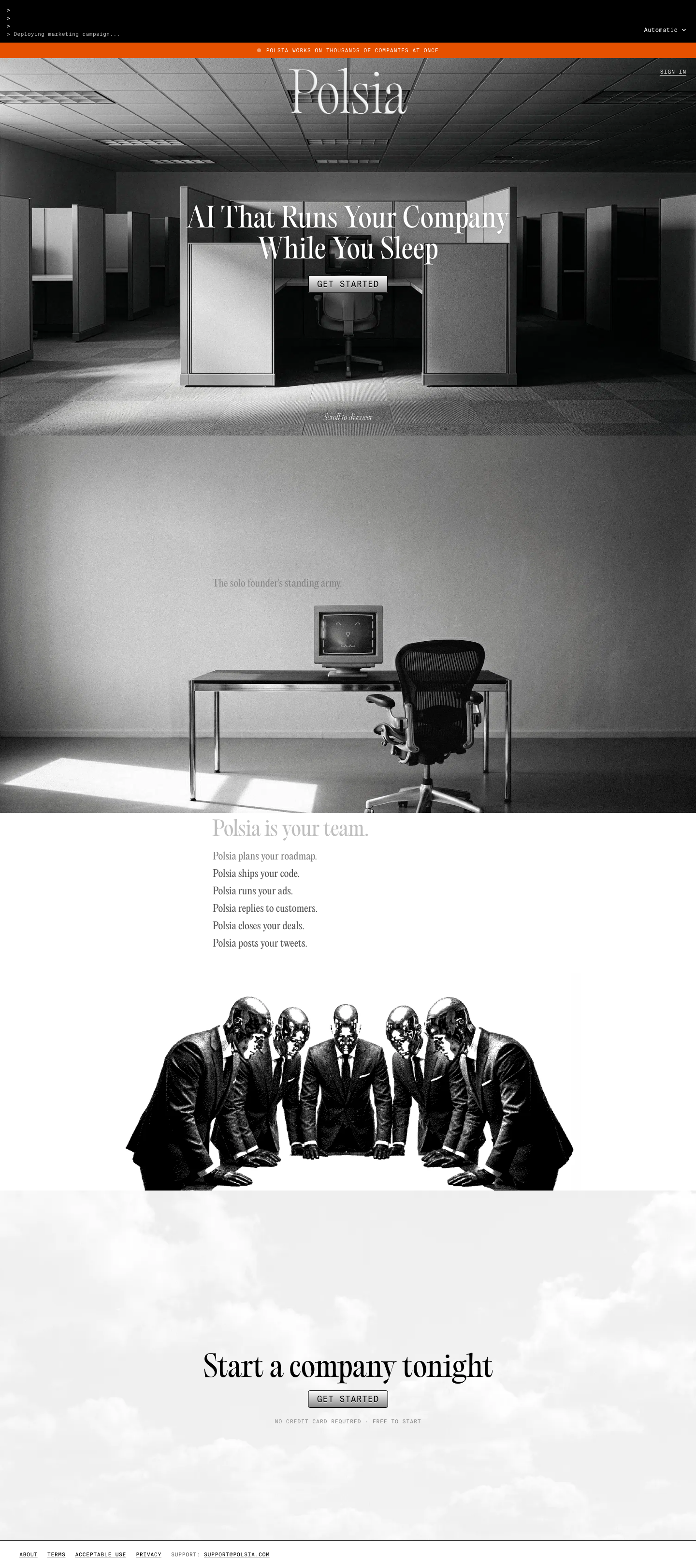
“A black-and-white editorial landing page with empty cubicles, a big serif title-case headline over the photo, a bevelled mono 'Get started' button, a short list of things the AI does and a surreal image of chrome-headed businessmen.”
The page described without its name. If this sentence could describe a hundred other sites, the design hasn't made a choice yet.
What's working
- A distinct, committed aesthetic: grayscale office photography, Editorial New with Suisse Mono, and a single orange accent used once in the ticker bar. It doesn't look like the usual purple-gradient AI site.
- The 'Polsia plans your roadmap / ships your code / runs your ads…' list is the clearest copy on the page: concrete, parallel, and specific to the product.
- The closing 'Start a company tonight' with 'No credit card required · Free to start' is a better CTA moment than the hero.
- Restrained palette (5 colours), no horizontal overflow, CLS 0.004, fast LCP on both widths.
Findings, ranked
-
The page never shows the product
HighspecificitySeen. Desktop and phone, full page: hero photo, empty-desk photo, a six-line text list, a businessmen illustration, then the closing CTA. No screenshot, no example output, no sample company, no dashboard anywhere.
Why it matters. Someone being asked to let an AI run their company needs to see what it actually produces before they'll trust it with that.
Fix. Between the capability list and the closing CTA, add one real artefact: a live feed or screenshot of Polsia's activity log for a real company (e.g. 'Deployed landing page · Sent 14 cold emails · Replied to 3 tickets'), using the existing mono type. The terminal ticker at the top shows you already have this content.
Effort: day
-
No proof behind 'thousands of companies'
HighspecificitySeen. Orange bar, both widths: 'Polsia works on thousands of companies at once'. Nowhere on the page is there a company name, a link, a result, a testimonial or a founder.
Why it matters. An unattributed big number on an AI product that claims autonomy reads as hype, and hype is exactly what this audience is looking out for.
Fix. Turn the claim into evidence: link the bar to a live count or a public gallery of companies Polsia runs, or show three named companies with what Polsia shipped for each. If you can't name them, cut the number.
Effort: hours
-
Hero CTA is a vague, small bevelled button
HighaffordanceSeen. Desktop and phone above the fold: 'GET STARTED' is a grey gradient bevelled button, 164×36 on desktop and 117×26 on phone. On the photo it reads at about the same weight as the cubicle panels around it. No supporting line under it.
Why it matters. The one action on the page should be the most dominant thing after the headline, and it should say what happens when you click.
Fix. Make it at least 48px tall and solid white with black text (or the orange accent), and change the label to what happens, e.g. 'Start your company free'. Move the 'No credit card required' line from the bottom CTA to sit under the hero button.
Effort: hours
-
Capability list and second section are faded to near-invisible
HighcontrastSeen. Desktop full: 'The solo founder's standing army.' is light grey on a grey photo, and 'Polsia is your team.' and the first list line are pale grey on white. Phone full: the first three list lines ('plans your roadmap', 'ships your code', 'runs your ads') are almost unreadable.
Why it matters. This is the only copy that explains the product, and on the way down a visitor can't read it.
Fix. This is probably a scroll-linked reveal caught mid-way, so check it with reduced motion and on a quick scroll. Whatever the cause, each line's resting state should be full-contrast black. Put the 'standing army' line on a scrim, or set it in white at 24px+.
Effort: hours
-
No h1 and no landmarks
MediumaccessibilitySeen. facts: h1Count 0, landmarks [], the only headings are h2. The hero headline and the 'Polsia' wordmark aren't headings.
Why it matters. Screen-reader users and search engines get no page title or structure, and SEO on 'AI co-founder' searches suffers.
Fix. Mark up 'AI That Runs Your Company While You Sleep' as the h1. Wrap the ticker and nav in <header>, the sections in <main> and the links in <footer>. Label the one input.
Effort: minutes
-
Top chrome takes up the first viewport
MediumhierarchySeen. Phone fold: a black terminal block of four lines ('> > > > Welcome to Polsia'), the 'Automatic' dropdown, then the orange bar, about 240px of the 844px viewport before the wordmark. The headline starts at about half the screen height.
Why it matters. On phone the decorative chrome pushes the promise and the CTA into the lower half, and 'Automatic ▾' is an unexplained control.
Fix. On phone, cut the terminal to one line, or merge it into the orange bar as a single rotating status line. Remove or label the 'Automatic' dropdown, which seems to be a theme switch: use an icon with an aria-label. Move the headline and CTA up by about 150px.
Effort: hours
-
Headline in title case, and the orange bar fails contrast
MediumtypographySeen. Hero: 'AI That Runs Your Company While You Sleep' is in Title Case at display size. Orange bar: 11px white caps on #E65100 measures 3.79:1.
Why it matters. Title case in a condensed serif reads as an ad, not editorial. Small caps on orange miss AA.
Fix. Set the headline in sentence case ('AI that runs your company while you sleep'). Darken the bar to about #C2410C, or set its text at 13px+ weight 500, to clear 4.5:1.
Effort: minutes
-
Console errors and failed requests in production
MediumcraftSeen. facts: two 401s, one 404, one DNS failure; 6–9 failed requests per load.
Why it matters. No visitor sees these, but they suggest half-wired auth or analytics calls, and a developer audience will open devtools.
Fix. Find the 401 and 404 sources (probably a session check or analytics script firing before auth) and either guard them or remove them.
Effort: hours
Also noticed
- 'Scroll to discover' is a cliché prompt that adds nothing; the photo already invites the scroll
- Four font files for three families; Editorial Old is used only 3–4 times and could be dropped
- The chrome-headed businessmen image is striking but unsettling; it may say 'replace your team' more than 'your team'
- Footer links are 17px tall tap targets on phone
- 1.17MB of JS for a 140-word page
- Images have no width and height set (CLS is fine for now)
- The 'standing army' section is a full-viewport photo carrying one line of text, so the page reads as long on phone with little content
Template tells
- Uppercase tracked-out mono for every small label (ticker, buttons, footer)
- Fake terminal '>' typing effect as decoration
- Unattributed 'thousands of companies' scale claim
Suggested order of work
- Add the h1 and landmarks, change the headline to sentence case, and fix the orange bar contrast 30 minutes
No h1 and no landmarks · Headline in title case, and the orange bar fails contrast - Rebuild the hero CTA as a solid 48px button with specific copy and the no-card line underneath; trim the phone top chrome half a day
Hero CTA is a vague, small bevelled button · Top chrome takes up the first viewport - Fix the resting contrast of the capability list and the 'standing army' line 2 hours
Capability list and second section are faded to near-invisible - Add a real activity log or screenshot section, and back up or cut the 'thousands of companies' claim with named examples 1–2 days
The page never shows the product · No proof behind 'thousands of companies' - Clean up the 401, 404 and DNS failures 2 hours
Console errors and failed requests in production
The numbers
Full page