Second Lookdesign review · 7 October 2026
linear.app
A product development and issue-tracking system where people and AI agents plan, build and ship software together. For Engineering and product teams at software companies, from startups to companies like OpenAI and Ramp.
First impression
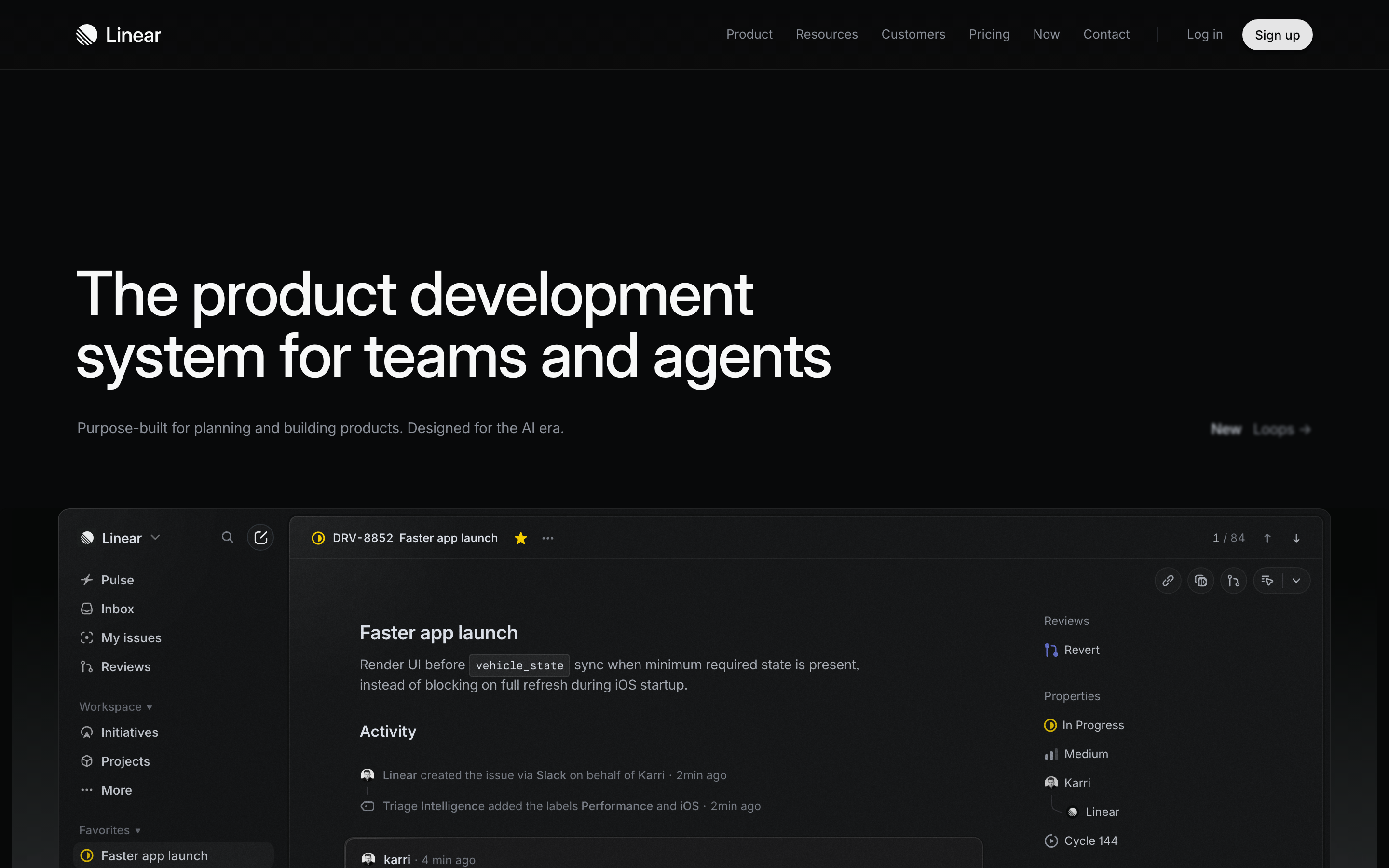
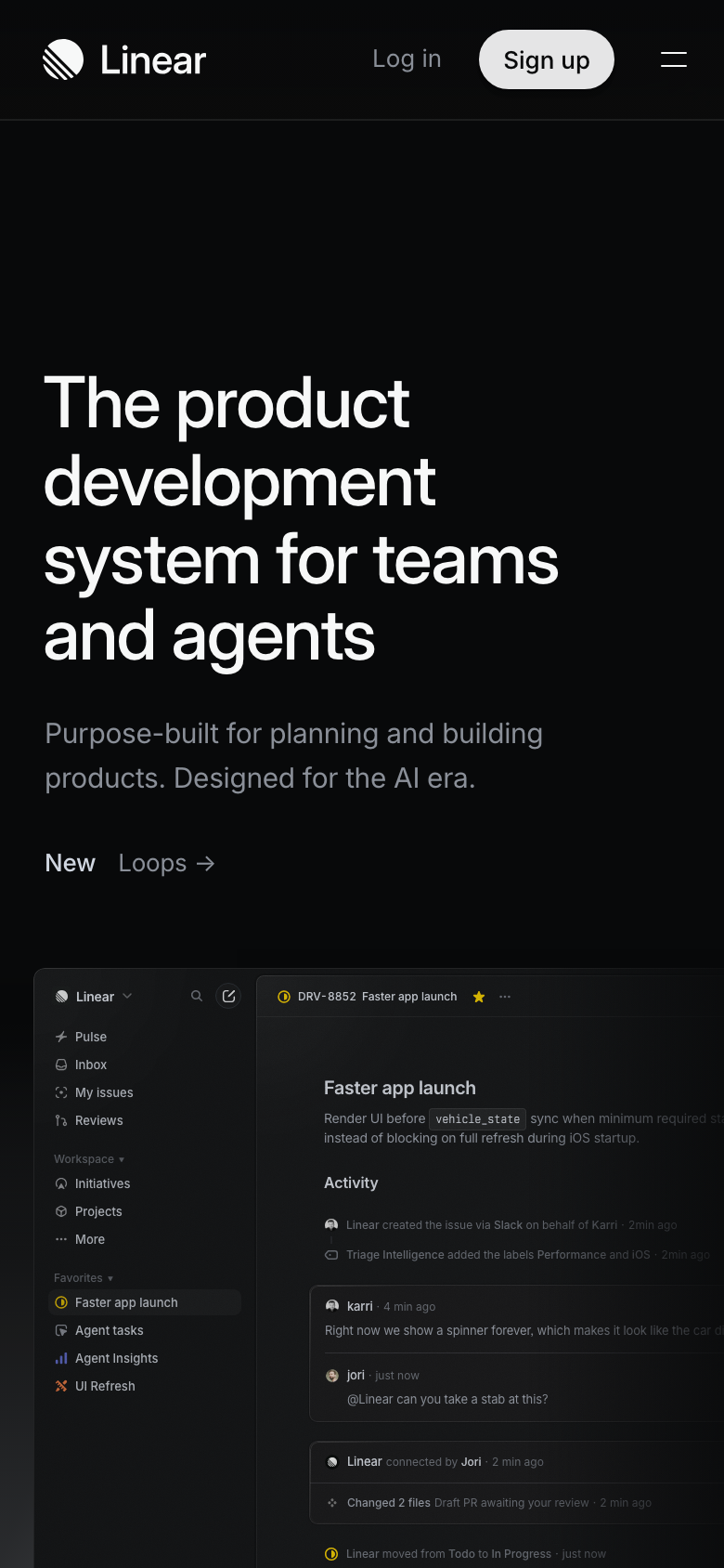
Ten-second test. Yes on both widths. The h1 says what it is and who it's for, and the real product UI sits right under it: an issue, its activity, and by t6 on desktop an agent panel taking a task and opening a PR. The only gap is 'what to do next': the sole action is the small nav 'Sign up', and the hero itself has no button.
“A near-black, all-Inter page that leads with a large plain headline and then a full-fidelity screenshot of the actual app, followed by four feature chapters, each shown through a live slice of the product: a Slack thread, a roadmap, an agent at work, a code diff.”
The page described without its name. If this sentence could describe a hundred other sites, the design hasn't made a choice yet.
What's working
- The product is the hero. A real, legible issue view with believable data (DRV-8852, vehicle_state, Karri and Jori) proves the claim better than any copy could.
- The palette is fully decided: tinted near-black #08090a, a cool grey ladder (#f7f8f8 / #d0d6e0 / #8a8f98 / #62666d), one hairline #24282c, and saturated colour only on in-product status dots, where it means something.
- One family with clear roles: Inter Variable carries everything, Berkeley Mono appears only in code. The headline sits on two lines at 64px on desktop, with tight leading and no decorative accent word.
- The motion is content. The agent panel types a task and reports 'Worked for 10 sec', the AI section shows an agent launching on ENG-2844, and the diff section shows a real code review. Reduced motion is honoured (522 animations drop to 101 on desktop).
- Section rhythm comes from space and type alone. There are no boxes, no rules plus backgrounds, and no card grids for content that isn't comparable.
- The phone layout is designed rather than stacked. The nav collapses to Log in, Sign up and a menu, the mockup bleeds off the right edge on purpose, and nothing scrolls horizontally.
Findings, ranked
-
The hero has no button of its own
MediumaffordanceSeen. Desktop and phone, above the fold: under the subhead the only element is 'New Loops →', a quiet announcement link. The only way to start is the 73×32 'Sign up' in the nav, and the page's first real CTA pair ('Get started' / 'Contact sales') appears at the very bottom.
Why it matters. A visitor convinced by the headline and screenshot has to go back up to the nav to act, and on phone that button is small and next to the menu icon.
Fix. Add a primary 'Start building, free' and a secondary 'Contact sales' on the subhead line, left-aligned under the copy, and keep 'New Loops →' on the right where it is now. Reuse the existing light pill style so the accent budget doesn't change.
Effort: hours
-
Too much empty space above the headline
MediumhierarchySeen. Desktop fold: about 280px of blank space between the nav rule and the h1, which pushes the product UI down to y≈730, so only its top third is visible. Phone fold: about 270px of empty black before 'The product' at 390 wide, so the mockup starts at the very bottom of the first screen.
Why it matters. The screenshot is the strongest proof on the page, and the empty band hides most of it on first load, especially on phone.
Fix. Cut the top padding of the hero roughly in half, to about 120–140px on desktop and 64px on phone. That brings the issue view and agent panel up into the first viewport.
Effort: minutes
-
Screen readers hear the headline twice, and the mockup's headings sit inside the page outline
MediumaccessibilitySeen. Facts: the h1's accessible text is 'The product development system for teams and agents The product development system for teams and agents', so a visual duplicate (probably for the text animation) isn't hidden. The mockup's 'Faster app launch' (h3) and 'Activity' (h4) come before the first h2, which causes the heading-order issue. Desktop also has 1 unlabelled input and 2 icon buttons without names.
Why it matters. Assistive tech gets a stuttering title and a fake outline, which undercuts a page that is otherwise carefully built.
Fix. Put aria-hidden="true" on the duplicate headline span. Render mockup titles as divs (or put aria-hidden / role="img" with a label on the whole mockup). Add aria-label to the two icon buttons and the input.
Effort: hours
-
Nav controls on phone are 32px tall
MediumaffordanceSeen. Phone, header: 'Log in' is 62×32 and 'Sign up' 73×32. The 'New Loops →' link is 24px tall.
Why it matters. These are the main conversion controls on a phone, and at 32px they fall below the 44px minimum for a comfortable thumb tap.
Fix. Keep the visual pill at 32px but extend the hit area to 44px with padding or a ::before overlay. Give 'New Loops →' 10px of vertical padding.
Effort: minutes
-
Phone carousels only signal scrolling by being cut off
LowaffordanceSeen. Phone, full page: the three 'Purpose-built / Powered by agents / Designed for speed' cards, the logo row and the testimonial ('Ou…') all clip at the right edge, with no dots, arrows or count.
Why it matters. The cut-off says there is more, but some visitors read a cropped card as a layout bug and scroll past.
Fix. Show a larger slice of the next card (about 15%) and add a subtle '1 / 3' indicator under the cards and testimonials.
Effort: hours
Also noticed
- LCP measured at 10.6s (phone) and 15.3s (desktop), but transfer is only 172KB and there is 1 font file. This is probably the animated hero mockup affecting LCP detection, not a real slowness; check it in field data.
- The 'Planning and monitoring' scatter chart and the 'Build, review, and ship' diff didn't move in 4.5s. They are probably scroll-triggered and fine.
- In the desktop full-page capture the feature sections look dim, which is probably scroll-reveal caught mid-way.
- Feature captions and the per-section 'Features' link lists are small, in #62666d/#8a8f98. They pass contrast but are close to the edge for 13px text.
- The phone h1 wraps to four lines at 38px; trimming to 34px would get it to three.
- The 'Performance' / 'iOS' label chips inside the mockup measure as 1.47:1 against the page, but they are product illustration, not controls.
- Blue, red and green appear only as status dots inside the product mockups. They are semantic, not competing accents.
Template tells
- Near-black page with a faint glow behind the product frame. Here it's Linear's own house style, which the template was copied from, and it's executed with restraint.
Suggested order of work
- Cut the hero top padding, and enlarge the hit areas of the phone nav controls and the 'New Loops' link to 44px. 30 minutes
Too much empty space above the headline · Nav controls on phone are 32px tall - Add aria-hidden to the duplicate h1 text, turn the mockup headings into non-headings, and name the two icon buttons and the input. 1–2 hours
Screen readers hear the headline twice, and the mockup's headings sit inside the page outline - Add a primary and secondary CTA pair to the hero on the subhead line. 2 hours, plus any A/B test
The hero has no button of its own - Widen the next-card peek and add position indicators to the phone carousels. 2 hours
Phone carousels only signal scrolling by being cut off
The numbers
Full page

