Second Lookdesign review · 7 October 2026
wix.com
An AI-assisted website builder (Wix Harmony) with built-in commerce, scheduling, marketing and hosting. For Small business owners, creators and freelancers who want a site without hiring a developer.
First impression
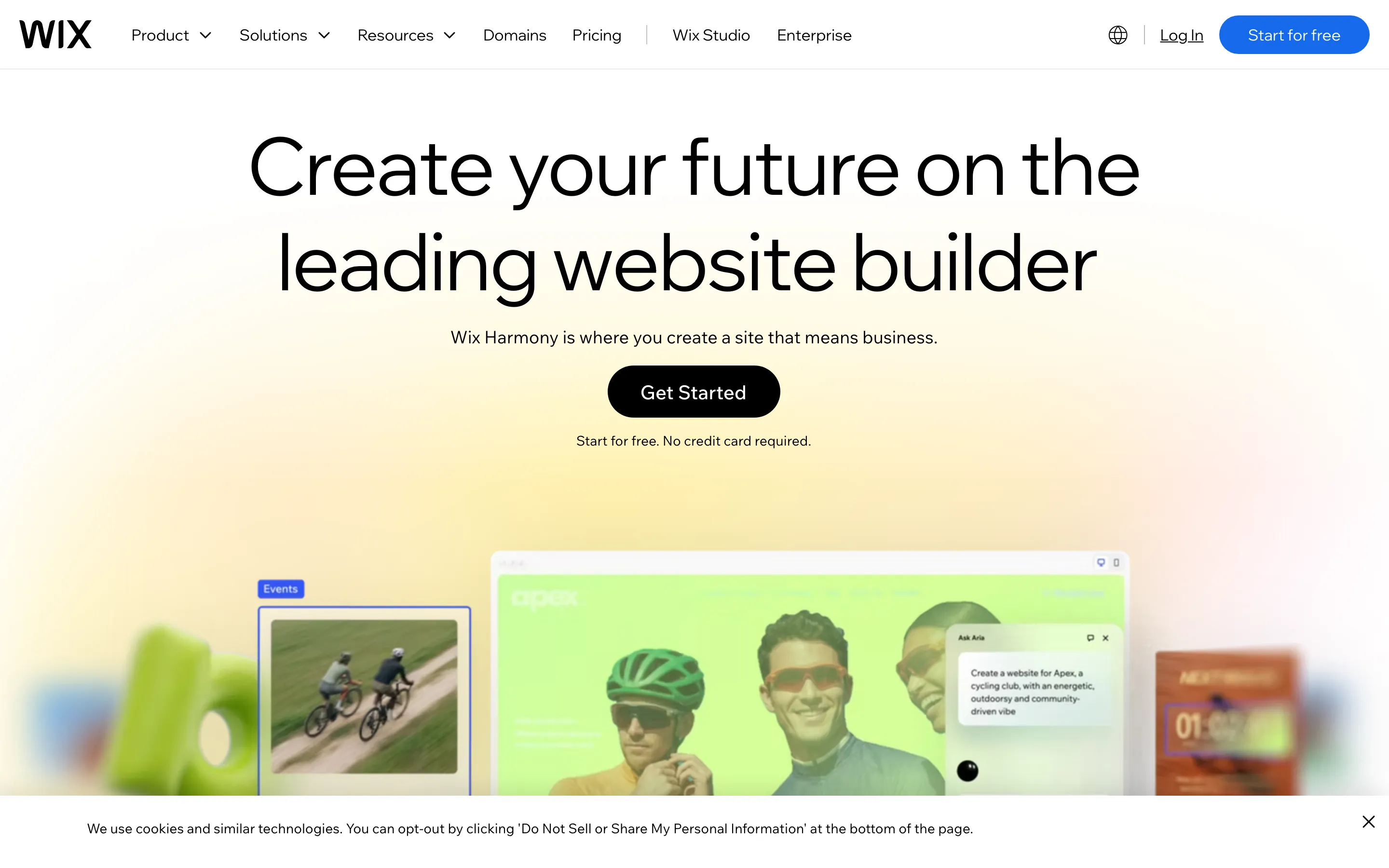
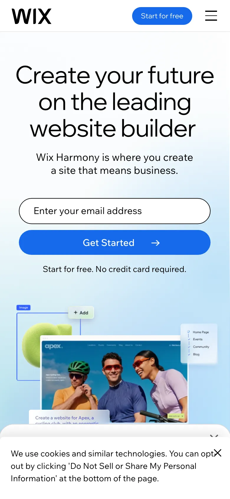
Ten-second test. On both phone and desktop the headline says 'website builder', and the hero shows a site being edited with an 'Ask Aria' prompt. The next step is clear: 'Get Started' plus 'Start for free. No credit card required.' The headline itself is a vague promise ('Create your future'), so the hero image and the word 'website builder' are doing the explaining. The first frame doesn't change at 3s or 6s, so the static state has to carry the message on its own, and it does.
“A white, airy SaaS homepage with a huge two-line sans headline, a pill CTA, a pastel gradient glow behind a mocked-up editor, then alternating product sections each ending in the same 'Get Started' button.”
The page described without its name. If this sentence could describe a hundred other sites, the design hasn't made a choice yet.
What's working
- The custom Madefor display face has a clear voice: large, light and tightly set. The desktop h1 fits on two lines and reads at a glance.
- The hero shows the actual product (editor canvas, Aria prompt, Events panel) instead of a stock photo.
- The palette is mostly black, white and one blue, and neutrals stay out of the way.
- The product shots further down (analytics dashboards, sales tables, template thumbnails) are real, specific and well cropped.
- The phone hero is designed rather than just stacked: an email field plus a full-width CTA, early in the viewport.
- Reduced motion is declared and honoured, there is one h1, heading order is clean and landmarks are present.
Findings, ranked
-
The primary CTA is black on desktop and blue on phone
Highconsistency of the action colourSeen. Desktop, above the fold: the nav 'Start for free' is blue #166aea but the hero 'Get Started' is a black pill, so two filled buttons in different colours compete. Phone, above the fold: the hero 'Get Started' is blue with an arrow and the nav button is also blue. Further down the desktop page every 'Get Started' is black.
Why it matters. The visitor learns 'blue means go' in one place and 'black means go' in another, and on desktop the eye splits between the nav pill and the hero pill.
Fix. Pick one fill for the primary action and use it everywhere. Either make every primary 'Get Started' blue, or make the nav button a quieter outline once the hero CTA is in view.
Effort: hours
-
Inactive solution tabs are pale grey at about 1.6:1
HighcontrastSeen. Desktop, 'Solutions to fuel every business move': 'Scheduling', 'Lead management', 'Blog', 'Online courses', 'Events' and 'Payments' are 54px h3s in #c9c9c9 on white. Phone shows the same list in black, so the problem is desktop-only.
Why it matters. These are the eight things Wix sells, and on desktop seven of them read as disabled. Low-vision visitors may not realise they can be clicked at all.
Fix. Use #6b6b6b or darker for inactive tabs (at least 4.5:1) and mark the active one with weight or the hairline rule, not by fading the others.
Effort: minutes
-
Section headings swing from 21px to 54px with no logic
HighhierarchySeen. Desktop: the h2 'Solutions to fuel every business move' and 'Website templates for any industry' are 21px small text on the left, while the h3s under them are 54px and the h2 'Website creation, as natural as thinking' is 48px. In the full page the section titles look like captions.
Why it matters. When a child heading is two and a half times the size of its parent, squinting at the page no longer shows its outline, and the sections read as unrelated slabs.
Fix. Set every section h2 to one size (around 48px desktop, 30px phone) and keep h3 tab labels below that (32–36px).
Effort: hours
-
The phone layout jumps while loading (CLS 0.34)
HighstabilitySeen. Phone: CLS was measured at 0.337, more than three times the 0.1 budget. Desktop is 0.063. On phone the hero visual, the stats strip and the cookie sheet all arrive late, and 130 images have no dimensions.
Why it matters. On phone, where most first visits happen, the CTA can move under a thumb mid-tap.
Fix. Give the hero media and the 300M+/90K+ strip fixed aspect-ratio boxes, add width/height to the 130 unsized images, and reserve space for the cookie sheet or render it as an overlay that doesn't push content.
Effort: day
-
The cookie sheet's close X collides with its own text on phone
MediumlayoutSeen. Phone, first viewport: the close X sits on top of 'opt-out' ('You can opt✕ out'). A second faint X peeks out above the sheet. The sheet takes the bottom ~20% of the viewport and hides the hero product shot.
Why it matters. It is the first thing a phone visitor dismisses, and it looks broken on the most-visited page of a company that sells website polish.
Fix. Give the sheet text right padding of at least 48px for the 44px close target and remove the duplicate X layer.
Effort: minutes
-
Every action is labelled 'Get Started'
MediumspecificitySeen. Desktop full page: 'Get Started' appears under the hero, 'Website creation', 'Solutions', 'Templates', 'Radical customization', Aria and the closing 'This is what ready feels like.' The nav uses 'Start for free'.
Why it matters. Each section promises something different (generate with AI, browse templates, add a store), but every button says the same thing, so none of them sets an expectation.
Fix. Keep 'Start for free' as the master CTA and make the section CTAs say what happens: 'Generate my site', 'Browse 2,000+ templates', 'Set up a store'.
Effort: hours
-
The headline is a values line, not a promise
MediumspecificitySeen. Desktop and phone h1: 'Create your future on the leading website builder.' The subhead names a sub-brand ('Wix Harmony') without saying what it does.
Why it matters. 'Create your future' could front any SaaS, so the image has to do all the explaining, and that image is half-blurred and partly hidden by the cookie bar.
Fix. Put the mechanism in the subhead, for example: 'Describe your business and Wix builds the site, then edit anything by hand. Free to start.'
Effort: minutes
-
The desktop hero product shot is washed out by the gradient
Mediumclarity of the product shownSeen. Desktop, above the fold: a lime overlay tints the editor mock, the right-hand card and the 3D shape are blurred, and the top of the visual is cut off by the fold and the cookie bar. Phone shows the same mock crisp and correctly coloured.
Why it matters. Desktop visitors get a muddy version of the one image that proves the product.
Fix. Drop the colour overlay on the editor frame, keep the blur only on peripheral props, and shift the visual up about 80px so the Aria prompt sits fully above the fold.
Effort: hours
-
The phone email field has no label, and blue CTAs lose contrast on hover
MediumaccessibilitySeen. Phone hero and footer domain search: two inputs rely on placeholders ('Enter your email address', 'Type the domain you want'). The domain placeholder measures 4.22:1. The blue 'Start for free' drops from 4.9:1 to 3.62:1 on hover (#2d83ff).
Why it matters. Screen-reader users hear an unnamed edit field on the main conversion path, and the hover state makes the most important button harder to read.
Fix. Add visually hidden labels or aria-labels to both inputs, darken placeholders to #6b6b6b, and make hover darker (#0f56c4), not lighter.
Effort: minutes
-
Template tells in the copy
LowvoiceSeen. 'Radical customization, remarkably simple', 'your unfair advantage', 'unshakeable foundations', 'as natural as thinking', 'This is what ready feels like.'
Why it matters. Interchangeable superlatives dilute the concrete things Wix can actually claim (2,000+ templates, 99.9% uptime).
Fix. Replace each with a fact that is already on the page, for example 'Start from 2,000+ templates or a sentence of text.'
Effort: hours
Also noticed
- The desktop full-page capture is blank for about 2,000px after 'Radical customization', and the phone has floating text fragments near the bottom. These are probably scroll-reveal frames mid-animation, not missing content, but check reduced-motion and slow devices.
- The 'Get Started' 1:1 contrast reading is a measurement artefact: the screenshots show white on black.
- LCP of 20–31s is inflated by background video, but 569 requests and 4 font files plus Arial fallback are heavy.
- Pure #000 on #fff throughout; acceptable for this brand but untinted.
- Nav 'Log In' tap target is 45×20; the phone 'Start for free' is 30px tall.
- Desktop measure reaches 131 characters in places.
- 8 desktop images are missing alt text.
- The 'You're in good company' closing band uses a looping gradient drift. It's decorative but below the fold.
- The '300M+ / 90K+' stats strip is a little generic but backed by a real brand.
- The template category tabs on phone are cut off at the edge ('Landi…'), which is fine as a scroll cue.
Template tells
- Pastel gradient-blob glow behind the hero and the closing band
- Stats counter strip (300M+ / 90K+)
- Superlative headline pairs ('Radical customization, remarkably simple')
- The same pill 'Get Started' closing every section
- Scroll-reveal on most sections
Suggested order of work
- Darken the inactive solution tabs, fix the cookie-sheet X overlap, label the inputs and darken the hover state 1 hour
Inactive solution tabs are pale grey at about 1.6:1 · The cookie sheet's close X collides with its own text on phone · The phone email field has no label, and blue CTAs lose contrast on hover - Choose one primary button colour and relabel the section CTAs half a day
The primary CTA is black on desktop and blue on phone · Every action is labelled 'Get Started' - Normalise the h2/h3 scale and rewrite the hero subhead half a day
Section headings swing from 21px to 54px with no logic · The headline is a values line, not a promise - Reserve space for hero media, stats and images to cut phone layout shift; clean up the desktop hero overlay 1 day
The phone layout jumps while loading (CLS 0.34) · The desktop hero product shot is washed out by the gradient
The numbers
Full page


Have a designer sign this, $20 Run your own site at secondlook.pageFree score in two minutes. The signed report is read and corrected by a designer, with anything the engine got wrong taken out.